
Test Any Website on 96 Phone, Tablet and Desktop Viewports
A Chrome extension that turns the tab you are already in into a real phone, tablet, foldable, laptop or desktop — with the right viewport, pixel ratio, user agent and safe areas — so you can see and test a live site the way that device sees it.
Coming soon to the Chrome Web Store — the listing is not published yet.
- 96 real device profiles
- Screenshots, recording and batch capture
- Runs in your browser, no account
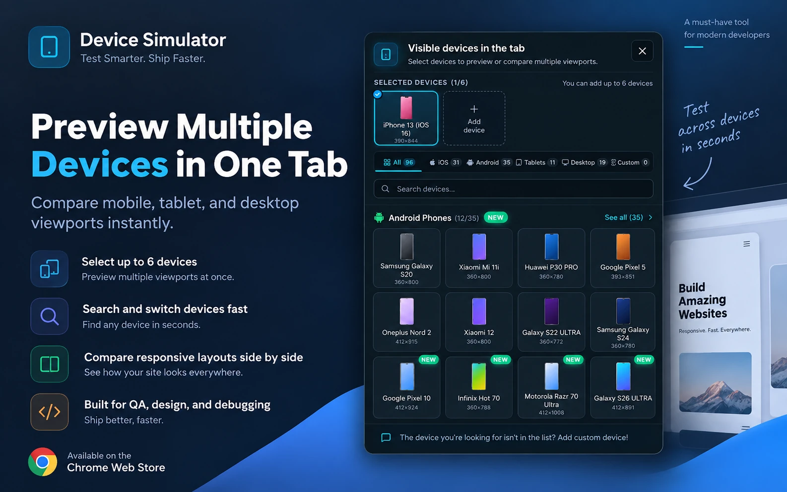
96 ready-made device profiles
Every profile is a measured device rather than a rounded-off width, so what you test against is the viewport the hardware actually reports.
31
iPhones
iPhone 5 through iPhone 17 Pro Max, plus iPhone SE, X, XR and iPhone Air.
32
Android phones
Galaxy S10 to S26 Ultra, Pixel 5 to Pixel 10 Pro, Xiaomi, OPPO, OnePlus, Huawei, Infinix and Zebra rugged handhelds.
7
Foldables
Galaxy Z Fold 2, Z Fold6, Z Flip3 and Z Flip6, Pixel 9 Pro Fold, Pixel 10 Fold and Motorola Razr 70 Ultra.
11
Tablets
iPad, iPad mini, iPad Air, iPad Pro 11" and 13" M4, Galaxy Tab S7 and S9 Ultra, Surface Pro 11 and Surface Duo.
11
Laptops and desktops
MacBook Air, MacBook Pro 14" and 16", iMac 24", Dell Latitude, and 1080p, 2K QHD and 4K UHD desktop widths.
3
Specialty screens
A Samsung smart TV, a self-service kiosk and a Sonoff NSPanel Pro wall panel.
1
Smartwatch
Apple Watch Series 6 (40 mm), for the smallest viewport you are likely to meet.
What a profile carries
Enough for the page to behave as it would on the hardware, not just to be the right number of pixels wide.
- Viewport size
- Device pixel ratio
- User-agent string
- OS name and version
- Notch geometry
- Safe-area insets
- Network type
- Photorealistic frame
Or describe a device of your own
Add a custom device with its own name, viewport, pixel ratio, OS, network type and user-agent string — for a handset that is not in the list, or for the exact breakpoint your design system cares about. Star the profiles you use most and set one as the default the simulator opens on.
Why the simulation holds up
Narrowing a desktop window changes the width and nothing else. These are the parts of a phone that actually break layouts, and the simulator reproduces each of them.
The page is told it is on a phone
The user agent and the client hints are spoofed for the page and for its iframes, so scripts that branch on the device see the device you picked rather than your desktop Chrome.
Touch behaves like touch
Touch events fire, scrolling has touch momentum, and the pointer becomes a mobile-style cursor — so hover-only affordances show up as the dead ends they are on a real phone.
The on-screen keyboard takes up room
Focus an input and a simulated keyboard slides up, along with the layout shift it causes. That is where sticky footers and short forms usually fall apart.
Mobile viewport units resolve correctly
vh, svh, dvh and lvh compute against the simulated viewport, and env(safe-area-inset-*) reports the real notch and home-indicator insets for the chosen device.
The chrome around the page is real chrome
The frame draws the OS status bar and the in-device address bar, so a full-height hero is judged against the space it actually gets. Either can be hidden for a clean shot.
Battery and clock are yours to set
Pin the status-bar clock and the battery level so a set of screenshots taken over an afternoon still looks like one session.
Rotate and zoom without reloading
Switch between portrait and landscape in one click and zoom the frame to fit your screen, while the page keeps its state.
PWA detection
A site that ships a web app manifest is recognised as installable, so you can check what it looks like when it is launched as an app.
One scroll, every breakpoint. Open several simulated viewports in the same tab, each running a different device, and synchronise clicks, scrolling and typing across all of them — so a single pass through a checkout covers the phone, the foldable and the tablet at once.
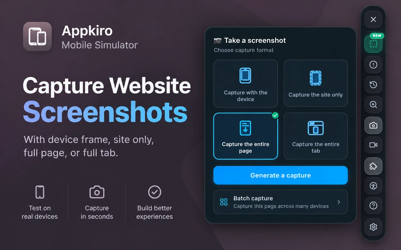
Four ways to capture what you are looking at
A screenshot of a simulated device is the artefact most of this work ends in — a ticket, a review, a store listing. All four modes land in the same editor.
Capture with the device
The page inside its device frame, status bar and all — the shot you want for a deck, a store listing or a client review.
Capture the site only
Just the simulated viewport, with no chassis around it, for a bug ticket that should show the page rather than the mockup.
Capture the entire page
Scrolls past the fold and stitches the whole page into one tall image at the device's width, however long the page runs.
Capture the entire tab
The whole browser tab, simulator panels included, when the context around the page is the thing worth showing.
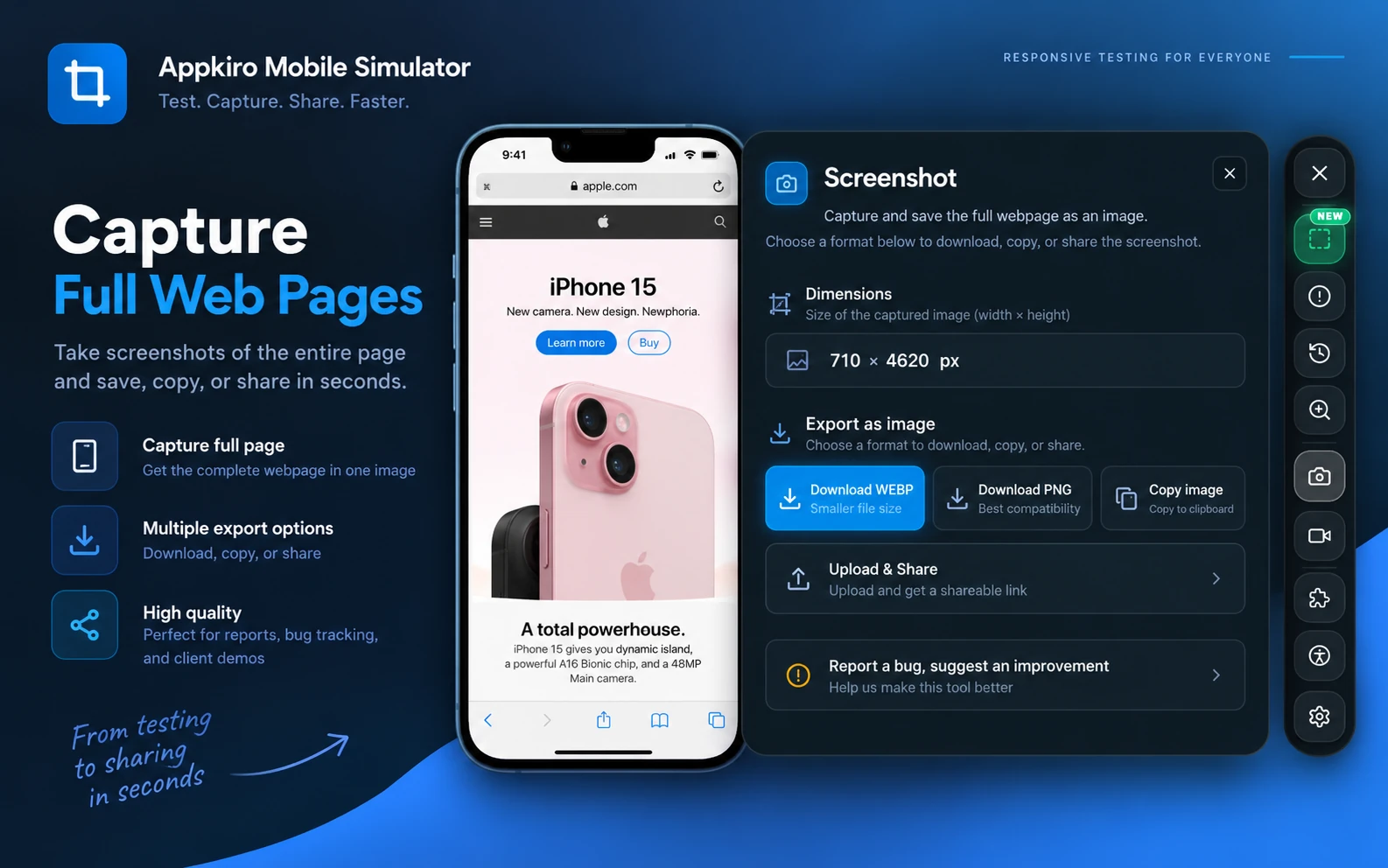
Mark it up before you send it
The capture opens in an editor, so pointing at the broken element does not mean saving a file and opening a second app.
- Pen
- Arrow
- Line
- Rectangle
- Ellipse
- Stroke colour
- Stroke width
- Undo
Then take it somewhere
Download it as PNG or WebP, copy it to the clipboard, or turn it into a share link. The full-page mode reports the stitched size before you export, so a very long page is not a surprise in the download folder.
Record the device, not your whole screen
Some bugs only exist in motion — a janky transition, a scroll that jumps, a keyboard that covers the submit button. A still cannot carry any of them.
Device or full tab
Record the simulated device on its own, so the clip is already framed as a phone, or the whole tab when the surrounding context matters.
Three quality levels
Trade file size against detail, with a countdown before recording starts and an optional transparent background behind the device.
Voice and camera
Add microphone audio to narrate what you are showing, and a camera overlay when the clip is a walkthrough rather than a bug report.
Recordings are saved as WebM, which every modern browser plays and most trackers accept as an attachment.
Shoot one page across a whole device matrix
Checking a release on twelve devices by hand is twelve device switches, twelve captures and twelve file names. Batch capture is one click and one folder.
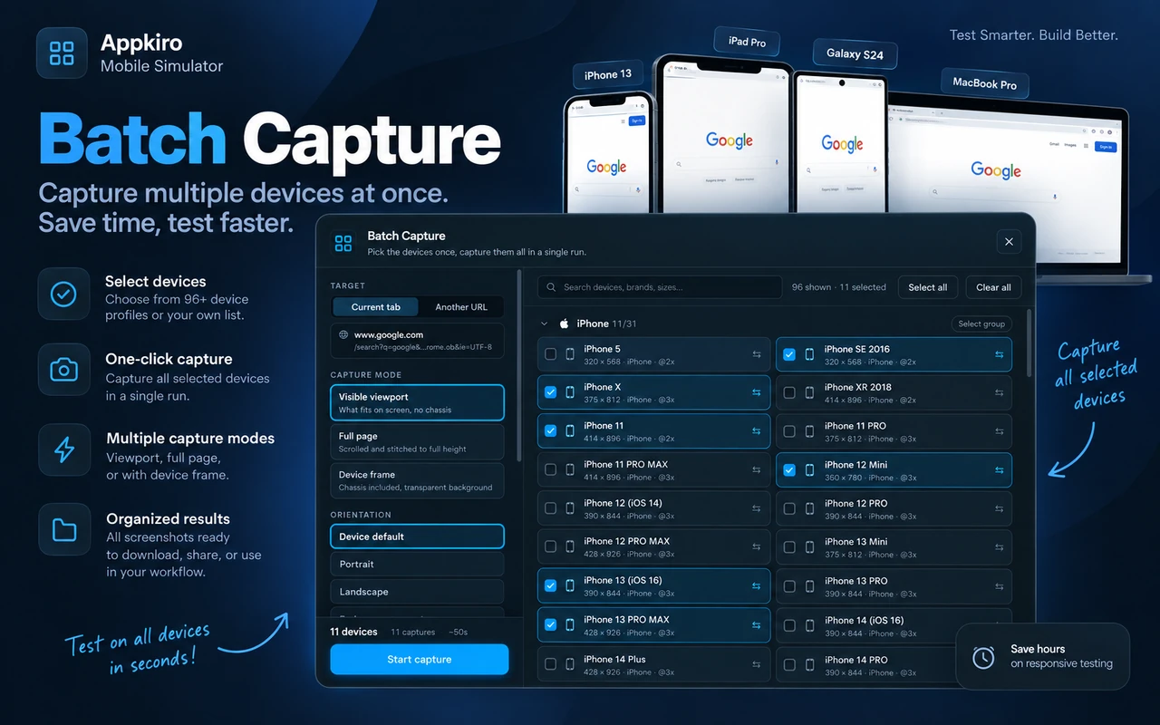
Select as many as you need
Any number of the 96 profiles, from the current tab or from a URL you paste in, in the device's own orientation or forced to portrait or landscape.
Watch it run, and fix only what failed
Live progress with a cancel button, and a retry that re-runs the captures that did not come back rather than the whole matrix.
Leave with a folder, not a mess
Export the run as a ZIP with predictable file names, or as a composed contact sheet that puts every device on one page.
Start from a preset
Ready-made selections for the sets people actually ship against, so a routine pass does not start with picking devices out of a list.
Built-in presets
- Common Phones
- iPhone Matrix
- Android Matrix
- Responsive QA
- App Store sizes
- Play Store sizes
An accessibility overlay at the device viewport
Tap targets, contrast and reach are all viewport-dependent, so auditing a page at desktop width misses the failures that only exist on a phone. The scan runs at the device you are simulating and draws its findings on the viewport itself.
Contrast
WCAG 1.4.3 and 1.4.11 ratios, reported with the foreground colour, the background colour and the level the pair needed to reach.
Tap targets
Measured on the real hit area: under 24×24 fails WCAG 2.5.8, and under 44×44 misses the touch-target guidance.
Headings
A missing h1, a skipped level, or a heading that renders with no text in it.
Missing alt text
Images with no alt attribute, images using their own filename as alt, and image buttons with no accessible name.
Focus order
Numbered tab stops drawn over the page, plus positive tabindex values, keyboard traps, and focus escaping an open modal.
Thumb reach
A one-handed reach heatmap, right or left handed, over the viewport you are currently simulating.
Clicking a finding highlights the element without changing the page. From there, “report a bug” assembles the whole thing for you — a screenshot, the CSS selector, the measurement that failed, and the device, viewport, orientation and URL it failed on.
Set the device up the way the shot needs it
The same page is a bug report one minute and a store screenshot the next. The chrome around it is a toggle rather than a rebuild.
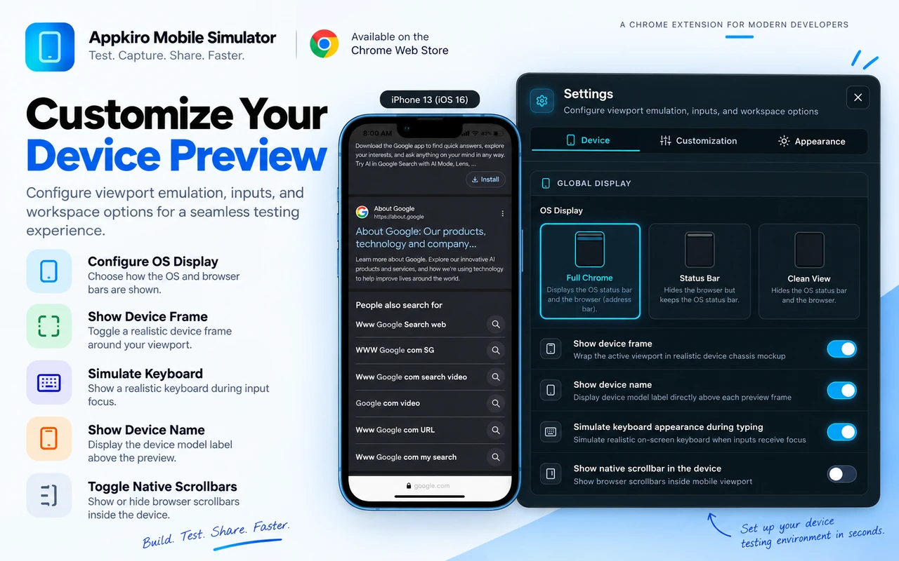
How much of the OS to show
Full chrome with the status bar and the in-device address bar, the status bar alone, or a clean viewport with neither.
Frame and label
Wrap the viewport in the device chassis and print the model name above it — or drop both when the page is the only thing that should be in the picture.
Keyboard and scrollbars
Show the on-screen keyboard when an input takes focus, and choose whether the desktop scrollbar is drawn inside the mobile viewport.
52 interface languages
The extension's own interface, translated into 52 languages, so the tool is not the thing that needs explaining on a shared screen.
Shortcuts and a right-click menu
Keyboard shortcuts and context-menu entries for activating the simulator, each of the four capture modes, and starting or stopping a recording.
Send a screenshot to an AI chat
Push the framed capture and your question into a ChatGPT or Gemini composer, with the page URL and the simulated device filled in. It never presses Send — you do.
How it works
Four steps from the tab you already have open to a capture someone else can act on.
- 1
Open the page you want to test
Any live URL in the tab you are already on. Local files work too, once you allow file access for the extension in chrome://extensions.
- 2
Pick a device
Search the 96 profiles by name, brand or size, star the ones you keep coming back to, and set a default so the next tab opens on it.
- 3
Use the site as if it were on that phone
Tap, scroll, type, rotate. Open a second and third viewport beside it and let clicks, scrolling and typing replay across all of them at once.
- 4
Capture what you found
A framed screenshot, a full-page capture, a WebM recording, or the same page shot across a whole matrix of devices in one run.
Nothing leaves your machine on its own. No account, no sign-up, no telemetry and no third-party analytics. The simulation and every capture run locally. A single image is uploaded only when you choose to turn that capture into a share link.
Who it is for
Anyone who has to answer “what does this look like on a phone?” and does not have a drawer full of them.
Front-end developers
Check a breakpoint at the width it actually breaks at, with the right pixel ratio and safe-area insets, instead of dragging a window until something looks wrong.
QA engineers
Reproduce a mobile-only bug on a desktop machine, then attach the framed capture, the device name and the viewport to the ticket.
Designers
Review an implementation on the device the design was drawn for, and export mockup-quality screenshots with the clock and battery pinned.
Product managers
Walk a stakeholder through the mobile experience in a shared screen, on the handset they own, without borrowing one.
Marketers and agencies
Produce store-listing and case-study images at the sizes each platform asks for, and document a delivery across a device matrix in one pass.
Accessibility reviewers
Run contrast, tap-target, heading, alt-text and focus-order checks at a mobile viewport, where most of those problems only appear.
What it is not
Worth knowing before you install rather than after. These are the questions a simulator cannot answer for you.
It is a viewport simulator, not a device lab
Pages render with your own Chrome engine. A genuine Safari or WebKit bug will not reproduce here, and neither will anything that depends on a specific phone's GPU, camera or sensors.
It is not a native app emulator
It simulates the browsing environment of a phone or tablet. It does not run iOS or Android builds, and it is not a replacement for Xcode's simulator or an Android emulator.
Some pages cannot be simulated
Sites that refuse to be framed, and browser-internal pages such as chrome:// and the Chrome Web Store itself, are off limits — Chrome does not let an extension render them this way.
Frequently asked questions
What it simulates, how it differs from DevTools, where your data goes, and what it costs.
What is the AppKiro Mobile Simulator?
It is a Chrome extension that turns a browser tab into a phone, tablet, foldable, laptop or desktop. It renders a live website at that device's viewport, pixel ratio, user agent and safe-area insets, and adds screenshots, screen recording, batch capture across devices, and an accessibility overlay on top.
How do I test a website on different screen sizes?
Open the page, activate the simulator, and pick one of the 96 device profiles. You can open several viewports in the same tab, each on a different device, and synchronise clicks, scrolling and typing across all of them so one scroll covers every breakpoint at once.
How is this different from Chrome DevTools device mode?
DevTools resizes the viewport and swaps the user agent. This adds photorealistic device frames with the OS status bar, on-screen keyboard simulation and the layout shift it causes, correct svh/dvh/lvh and safe-area insets, side-by-side synchronised viewports, device-frame and full-page screenshots, screen recording, batch capture across a device matrix, and an accessibility overlay.
Do I need a real phone or a device lab?
No. Everything runs inside your own Chrome, on the machine you already have. It is a simulation of the browsing environment rather than the hardware, so it covers layout, viewport and input questions but not hardware-specific or WebKit-specific bugs.
Which devices are included?
96 profiles: 31 iPhones, 32 Android phones, 7 foldables, 11 tablets, 11 laptops and desktops, 3 specialty screens such as a smart TV and a kiosk, and one smartwatch. You can also add your own device with a name, viewport, pixel ratio, OS, network type and user-agent string.
Can I take a screenshot of the simulated device?
Yes, in four modes: with the device frame, the site only, the entire page stitched into one tall image, or the whole browser tab. Captures open in an editor with pen, arrow, line, rectangle and ellipse tools, then export as PNG or WebP, copy to the clipboard, or become a share link.
Can I screenshot one page on many devices at once?
Yes. Batch capture takes any number of the device profiles and shoots the same page across all of them in a single run, with live progress, cancel, retry for only the ones that failed, a ZIP export and a composed contact sheet. Presets cover common phones, the iPhone and Android matrices, responsive QA and app-store sizes.
Does it collect my browsing data?
No. There is no account, no telemetry and no third-party analytics. The simulation and the captures run on your machine. The only thing that ever leaves it is a single image, and only if you choose to turn that capture into a share link.
Can I test a site running on localhost or a local file?
A local development server works like any other URL. For a file:// page, allow file access for the extension on the chrome://extensions page first.
What does it cost, and what does it need?
Nothing — every feature is unlocked, with no account and no subscription. It needs Chrome 116 or newer with Manifest V3 support, and its interface is available in 52 languages.
Tools for what comes after the test
Browser-based AppKiro tools for the steps around a responsive pass — icons, crops, conversions and contrast.
- App Icon GeneratorProduce every icon size a mobile app or PWA manifest asks for.
- Social Media Image CropperCut device screenshots down to store and social listing sizes.
- Image ResizeBring a tall full-page capture down to a size a tracker will accept.
- Image to WebP ConverterShrink a heavy screenshot before attaching it to a ticket.
- Color Contrast CheckerRe-check a pair the accessibility overlay flagged, ratio by ratio.
- Video to GIFTurn a WebM recording of the device into a GIF for a pull request.
One tab. Every screen your visitors use.
Free, no account, and nothing leaves your machine unless you ask it to.
Coming soon to the Chrome Web Store — the listing is not published yet.